Dashboard Filter Controls
Filter Controls are filters that can be placed anywhere on a dashboard to filter any chart that uses the data column being filtered. Like the filter modal, the filter components also list formulas in the column selection dropdown.
Qrvey provides a set of filter controls that you can drag and drop to the canvas inside the Dashboard to make them available to end-users when the page is published or embedded.
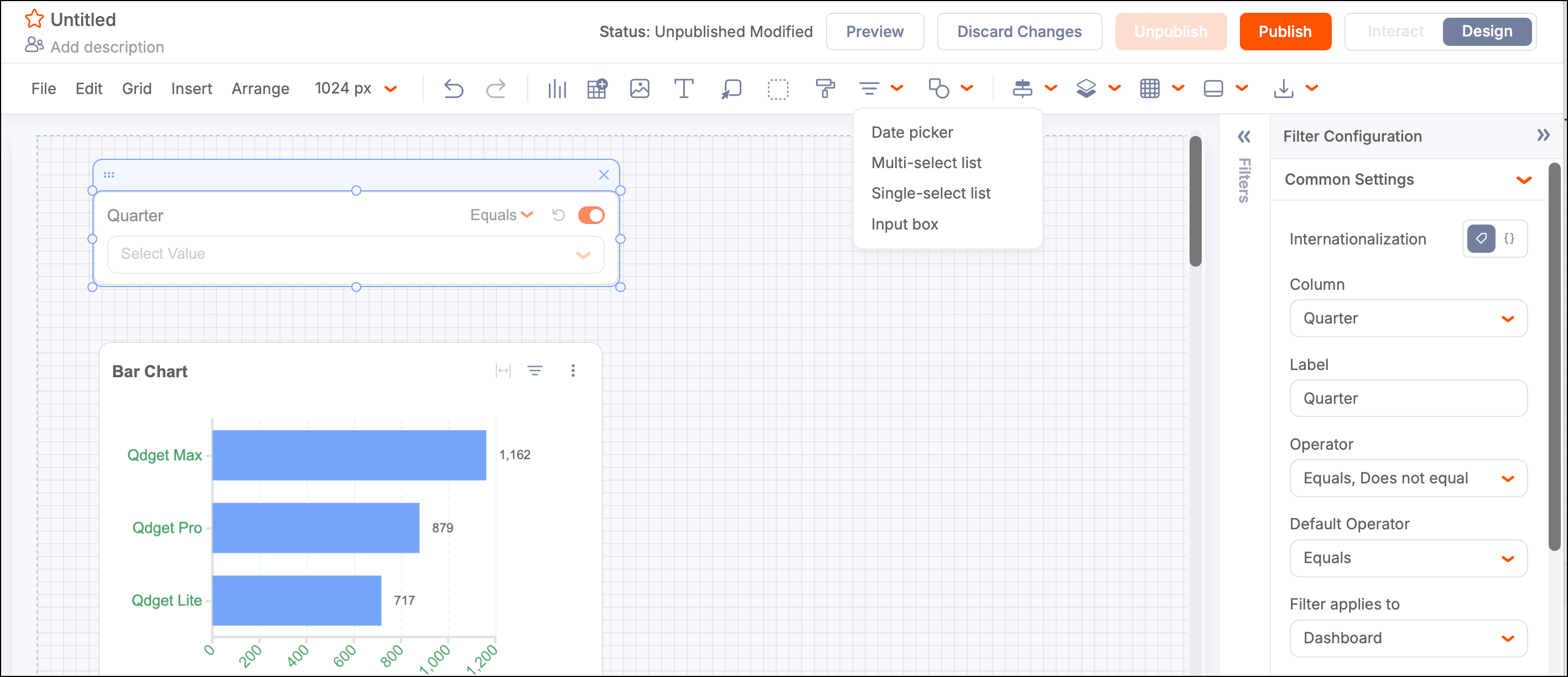
Date Picker
Use the date picker as a calendar to filter multiple columns across datasets. For example, you can filter both hire date and shipped date with one control.
Common Settings
- Column - The dataset columns used for filtering.
- Label - Custom filter control label.
- Operator - Default logic operator (for example, EQUAL).
- Filter Applies to - Defines the scope affected by the filter control. The default is “Dashboard.” It can also be set to “Container” to apply only to elements within a container, or to “Tab” to apply only to elements within a tab.
More Settings
- Hint - Customizes the dropdown hint text.
- Trigger - Sets filtering to start automatically or using a button.
- Button Text - Sets the button text.
Style Settings
- Selectors / Checkboxes - Default color of the icon.
- Button Background - Default color of the background.
- Button Border - Default color of the button border.
- Button Text - Default color of button text.
- Background - Default color of the background.
- Border - Default color of the border.
- Font Type - Default font type.
- Font Color - The default label and the selected values use this color.
Multi-select List
Use a Multi-select list to enable the end user to apply the same filter to one or more columns, from any dataset used in the Dashboard.
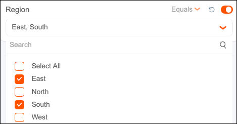
Common Settings
- Column - The dataset columns used for filtering.
- Label - Custom filter control label.
- Operator - Default logic operator (for example, EQUAL).
- Filter Applies to - Defines the scope affected by the filter control. The default is “Dashboard.” It can also be set to “Container” to apply only to elements within a container, or to “Tab” to apply only to elements within a tab.
Source Data
- Dataset - Specifies the dataset for display and value columns.
- Display Column - Column values displayed in the filter.
- Value Column - Column values used for filtering.
More Settings
- Hint - Customize the text string "hint" displayed in the dropdown menu.
- Type - Show as dropdown or list.
- Trigger - Select Automatic (default) or the Button to define what triggers the filter.
- Cascade Filter - Select this item to add a cascade effect.
- React to Cascading Column - Define the filter and data column to initiate the cascading.
Style Settings
- Selectors / Checkboxes - Default color of the icon.
- Button Background - Default color of the background.
- Button Border - Default color of the button border.
- Button Text - Default color of button text.
- Background - Default color of the background.
- Border - Default color of the border.
- Font Type - Default font type.
- Font Color - The default label and the selected values use this color.
Add a Cascade Effect
Multi-select list filters can be chained together to create a cascading effect. This feature is used when hierarchical groups are present and you need one filter value to limit the available choices in the next. One example is when States and Counties are listed in two filters and they are linked so that choosing a state from the first filters the second to the counties of the selected state. To create the cascading behavior, follow these steps:
-
Add at least two Multi-select filters to a dashboard page based on two columns of the same dataset.
Make sure that there is a logical hierarchy between the two selected columns (for example, Country > State or School > Students).
-
In the configuration panel for the second filter, select the Cascade filter checkbox. This indicates that the values presented in this list are filtered when the user selects one or more values from another filter.
-
Define the filter and data column to initiate the cascading filter by selecting a data column from the React to cascading column list. The dropdown automatically lists columns that belong to the same dataset and have been set as the selected column in another Value List filter on the page.
-
Publish the page or go to Preview Mode to test the filters in action.
Note: Filter controls do not work in Design Mode. You can only interact with them in Preview or Interaction mode.
Single-select List
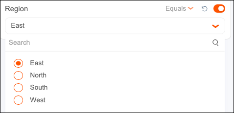
Use a Single-select list to restrict users to filter a single value from any dataset used in the dashboard. Users can apply the filter to multiple columns across datasets. While it permits the same options as the Multi-select list, the interface displays a radio button next to each option instead of a checkbox.
Input Box
Use the Input Box to enable end users to enter text and search for it in any selected column. Select Input Box from the list of filter controls in the toolbar, drop it on the page, and size it appropriately. The control consists of a label, an input text box, a dropdown list of operators, and a button to apply the changes and start the search.
Common Settings
- Column - The dataset columns used for filtering.
- Label - Custom filter control label.
- Operator - Default logic operator (for example, EQUAL).
- Filter Applies to - Defines the scope affected by the filter control. The default is “Dashboard.” It can also be set to “Container” to apply only to elements within a container, or to “Tab” to apply only to elements within a tab.
More Settings
- Hint - Customizes the dropdown hint text.
- Trigger - Select Automatic (default) or the Button to define what triggers the filter.
Style Settings
- Selectors / Checkboxes - Default color of the icon.
- Button Background - Default color of the background.
- Button Border - Default color of the button border.
- Button Text - Default color of button text.
- Background - Default color of the background.
- Border - Default color of the border.
- Font Type - Default font type.
- Font Color - The default label and the selected values use this color.
Selecting the Input Box component enables the configuration panel where you can configure the default settings.
Scope Behavior in Filters
The scope configuration (Filter applies to) is available for all filter controls in a dashboard. It determines whether a filter applies to the entire dashboard, the current tab, or the elements within a container. The default scope is Dashboard. Tab and Container scopes are listed in the Filter applies to dropdown after they have been added to the dashboard.