Aggregate Formulas
Aggregate formulas are a powerful customization tool that uses aggregated data to produce calculations.
Overview
Default formulas use raw data columns directly, one record at a time. Aggregate formulas instead operate on aggregated results such as average, sum, and count. This lets you compare aggregated measures against each other (for example, average inventory quantity to average safety stock level).
Aggregate Formula Tutorial
The following tutorial video shows how to use aggregate formulas in charts. It features the additional use cases described later on this page.
Tags: Charts, Formulas, Aggregates
Create an Aggregate Formula
-
Select a dataset and open the Analyze tab.
-
Open Formulas (sigma icon). The default view displays formulas that use raw column inputs.
-
Switch to the Aggregate Formulas section and select New Aggregate Formula.
-
Complete the fields in the Create Aggregate Formula dialog. Qrvey only supports standardized syntax for this formula type.
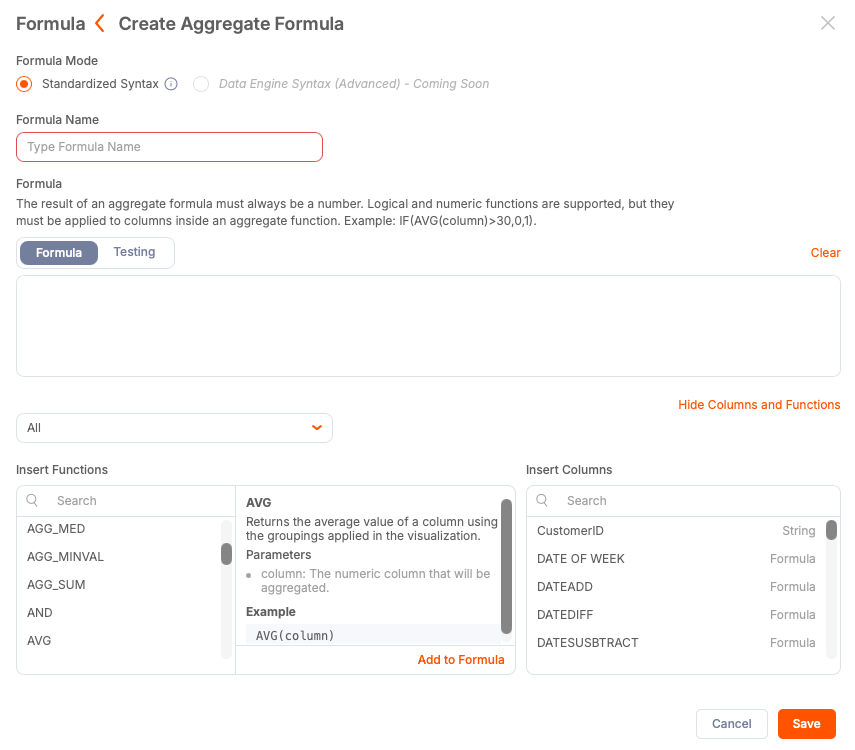
a. Enter a name for the formula.
b. Build your expression.
c. Save your changes. The editor validates the expression and highlights any errors.
After the aggregate formula has been saved, you can use it in any chart that accepts aggregated values.
Use Case: Inventory Safety Stock Indicator
You want to create a single metric that shows whether the average stock quantity across product lines is within the safety stock levels. Rather than display two separate numbers and divide them yourself, you can create one indicator with the calculated result of dividing the values.
This use case can apply the following aggregate formula:
AVG(Quantity) / AVG(SafetyStockLevel)
After saving the formula, you can add it to an indicator chart. For this use case, if the metric indicator is 1.0, you have exactly enough stock to match the safety stock level. If it is less than 1.0, you are running a deficit. If it is more than 1.0, you are running a surplus.
Use Case: Ratio and Delta by Dimension
Aggregate formulas can be reused in different chart types. After creating the ratio indicator used in Inventory Safety Stock Indicator, you can adapt this formula for use across dimensions such as size, region, or product line.
To create a bar chart that highlights the actual gap between inventory and safety stock, you can use a delta formula in the chart value:
AVG(Quantity) - AVG(SafetyStockLevel)
Using this formula as the chart value shows positive (surplus) and negative (deficit) results by category. A practical application of this data can be to inform reorder decisions.
Highlight Issues with Conditional Formatting
To identify outliers, you can apply conditional formatting to the chart. For example:
If stock level surplus is less than or equal to -100, then highlight the bar as a low stock alert.
Products that require urgent reordering are more easily identified. You can also enable drill-through functions from the chart to investigate individual records behind the aggregated statistics.
Best Practices
- Aggregate formulas operate on aggregated results. If you need row-level calculations, use default formulas instead.
- Use clear formula names to enable their access for reuse across charts (for example, stock level indicator or stock level surplus).
- Validate formulas before saving to detect syntax errors.
- Select a chart suitable to the aggregate (for example, ratios for single-value indicators or deltas for bar charts that show magnitude).
- Apply conditional formatting to identify thresholds and outliers.
- Reuse aggregate formulas across multiple chart types to ensure consistent dashboard display and reduce duplication.